Every year the integrated digital media (IDM) program has a showcase where current students show off the amazing projects they have made throughout the year. It's a great opportunity to show prospective students, people the students know, members of the NYU community, and potential employers what IDM students create during their tenure.
We had about 2 - 3 months on this project. Everyone on the team was a current student and I was an administrator with other duties, so we were all working on this on our extra time. We began February 15th and had the site active on April 26th to promote our May 17th show.
Here is a link to the website hosted on one of the collaborators github page.
The problem we were trying to solve was, how do we spread the word about the IDM showcase? We chose to build a website. We felt it would cover questions like:
- How can we spread information about the show, ie location, time, what to expect, to students and general people in the Metrotech community?
- How can we create an easy way for people to RSVP to the IDM showcase?
- How can we give people who are interested more information on what the show is and why they should come?
- The show was curated and given a visual theme, so incorporating these into our solution would be great
Being both a digital focused program and understanding the reach potential for the web, we dedicated a team to build out a RSVP website.
I was inspired by the parsons master of design and technology program's website documenting their student projects from their showcase and I pitched that we should do the same for our showcase. Everyone was on board and excited about it. Since everyone had classes along with the showcase, I took on the challenge of implementing this side of the site.
We had a team of 7 people. One project manager, a lead designer, and the rest of us were programmers and designers tasked with certain parts for completing the site.
The whole team had a brain storm session of how we wanted the general layout of the site to look and what should be there.
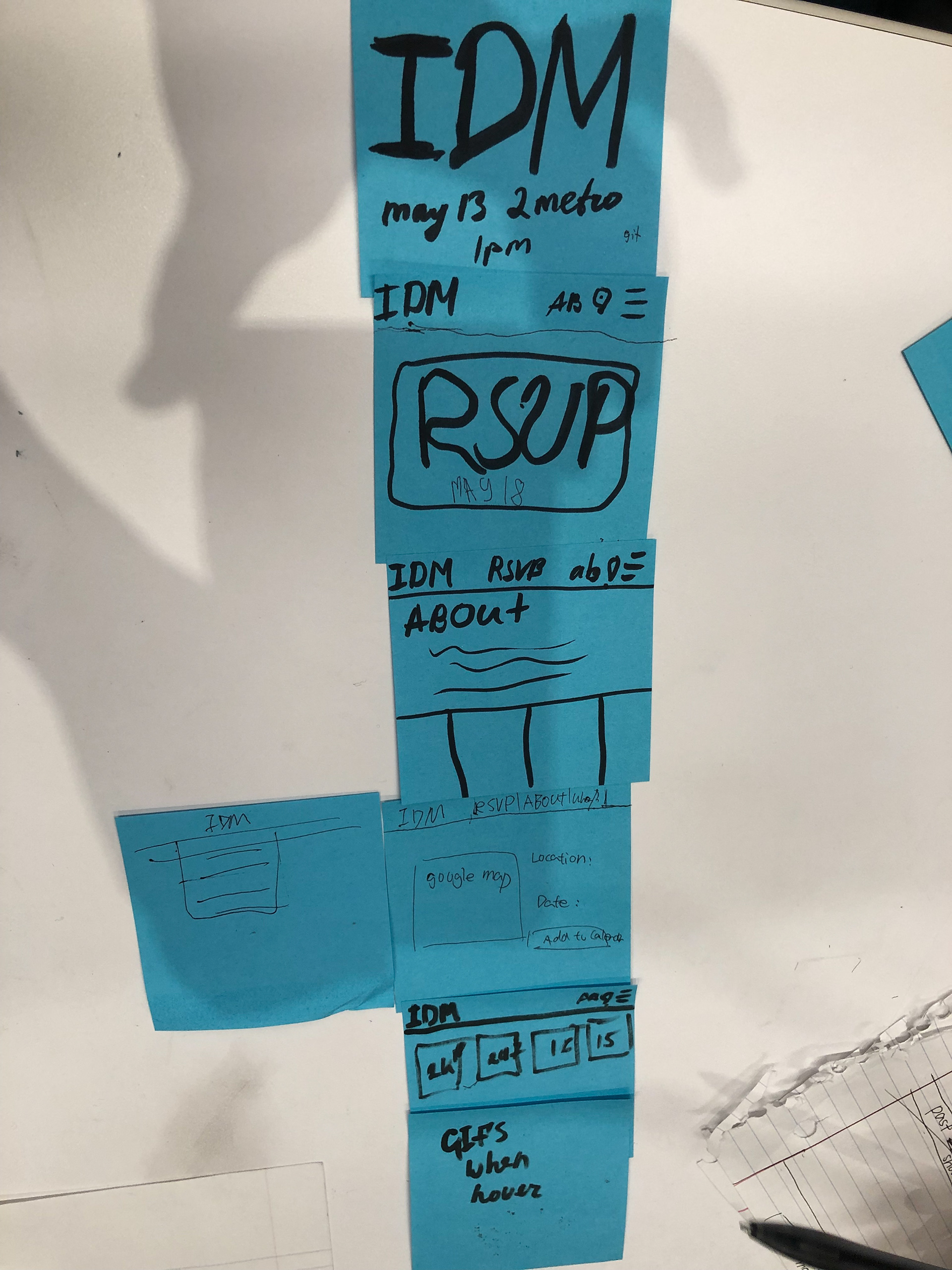
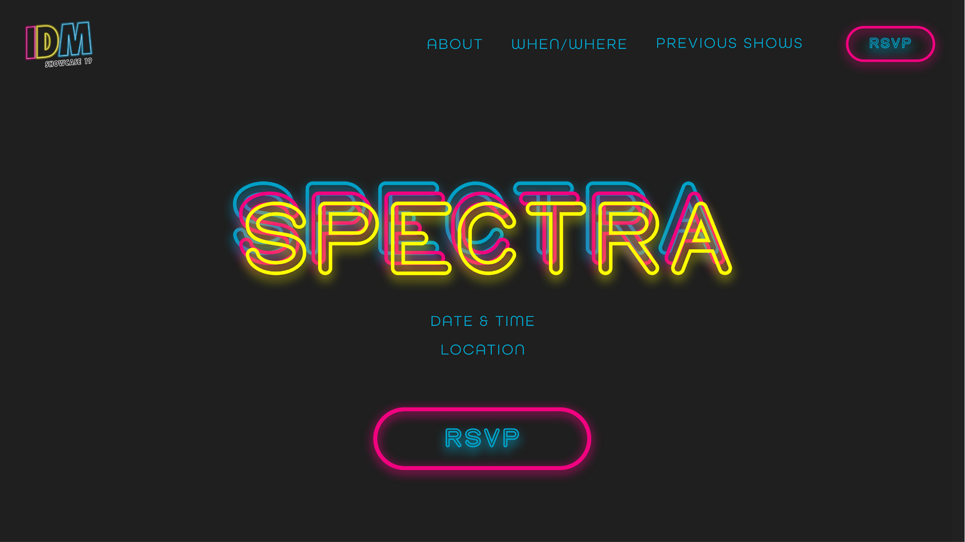
We decided on the blue layout for a simple one page layout with defined sections to have access to all the information someone coming to the site might need on one page.
The lead designer, Sara, created a high fidelity design of the page. The landing page is picture below, feel free to check out the full adobe xd design.
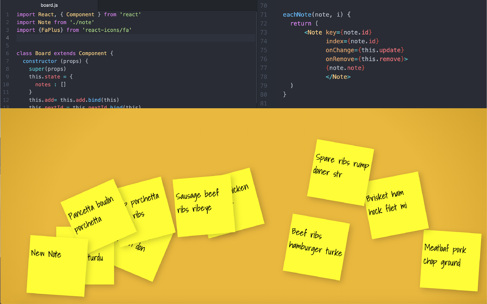
I kept this style in mind for my project section. Since I was working solo, I decided I would design and code at the same time to speed up my prototyping process. This build out ended up using html, css, react, web scraping, data cleaning, and a lot of patience.
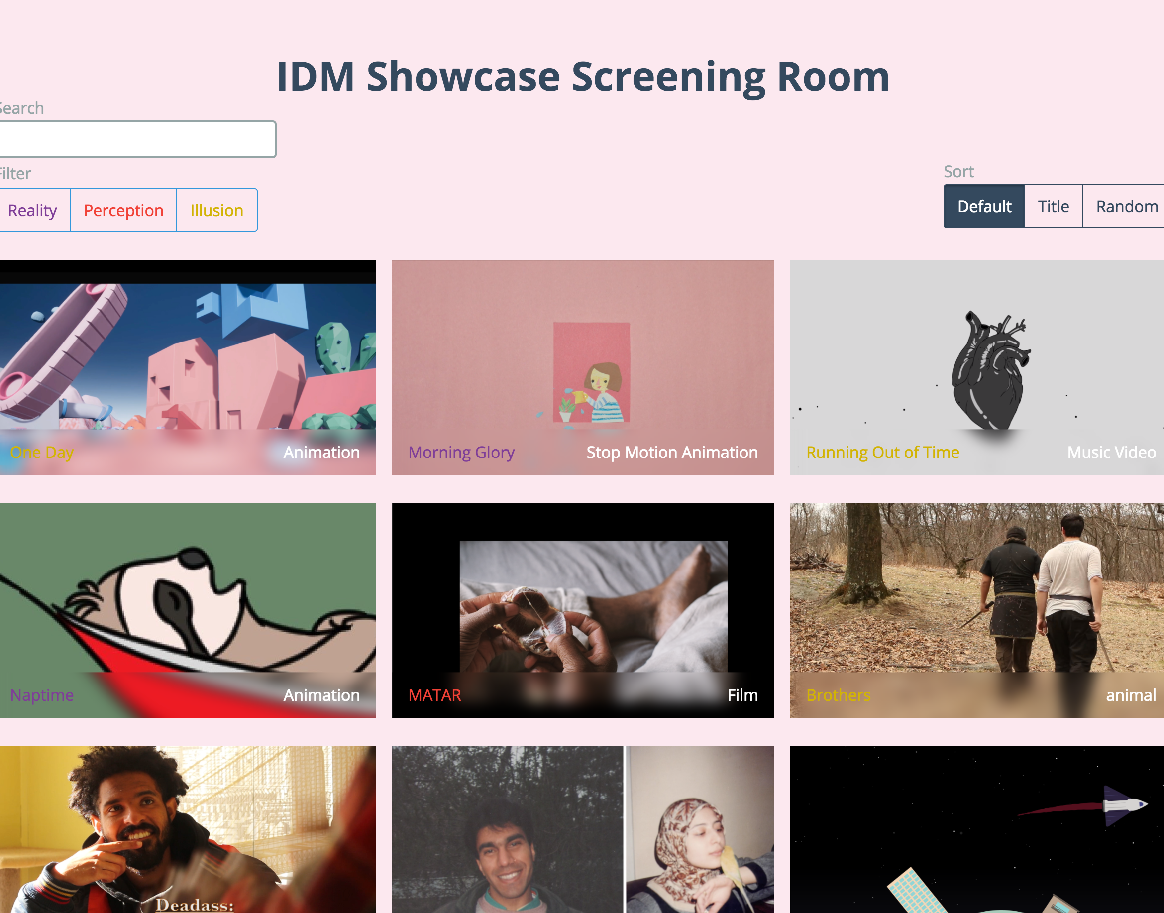
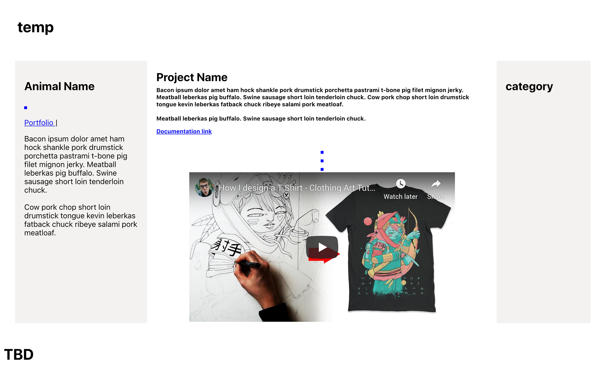
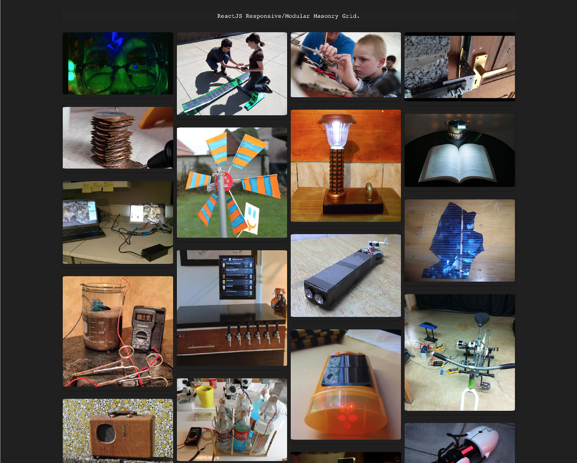
This was the end result.
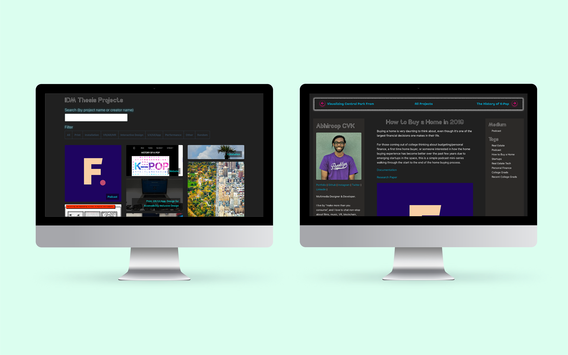
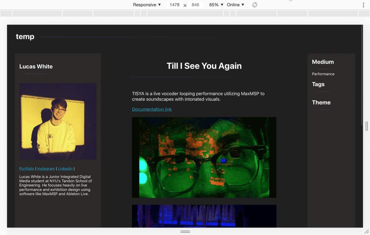
To get to the above, I started by searching for some code templates. I needed a landing page template with multiple projects in a grid layout and a template that could work as a profile page. I found shuffle.js which both had a grid, search, filter, and shuffle functionality so we could have the page feel dynamic when people reload or land on the page. I found the "holy grail layout" by phillip walton for the profile page which had a great 3 section split.

Along my search I also learned about reactjs. Reactjs was really helpful because each student's project page would use the same template, but I didn't want to do the tedious work of changing the pictures, text, and links for each project manually.
Reactjs offered a coding system that could automate filling the data for each page. I decided that even though I didn't know reactjs, I would learn it because the benefits towards launching the page seemed worth it. Especially since I knew projects would be coming in last minute so having a system to create the webpages automatically would make launching on time more likely.
I used a linkedin learning tutorial to start off, then began reading documentation, and doing little tests.
Once I had a foundation on react, I ported over the layout code for the landing page with multiple projects and the 3 section "holy grail layout". The landing page was lacking without many projects, but the "holy grail" was looking good.
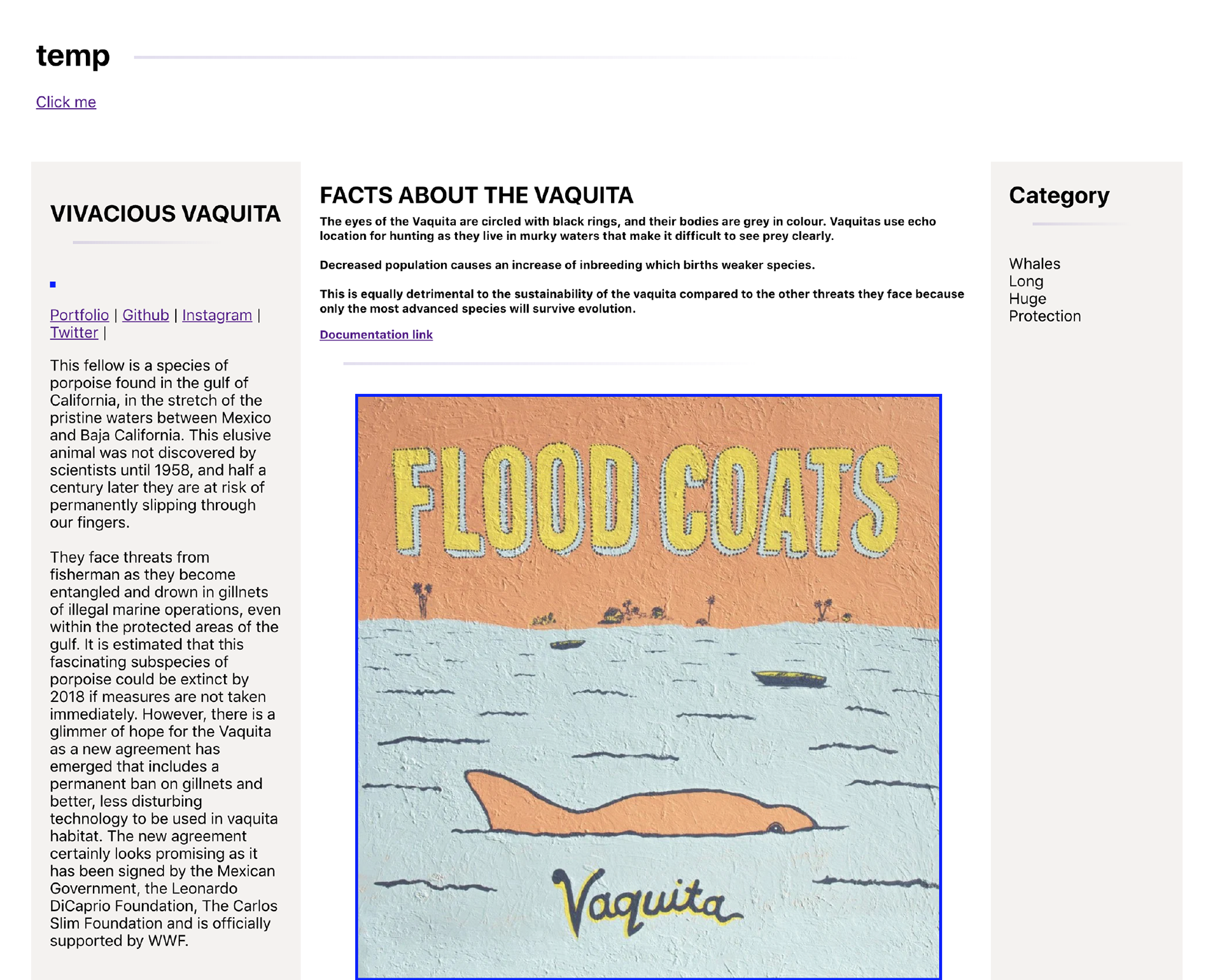
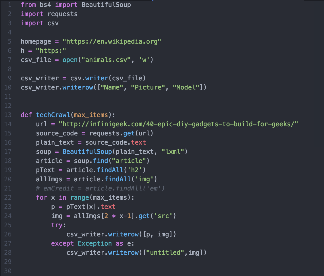
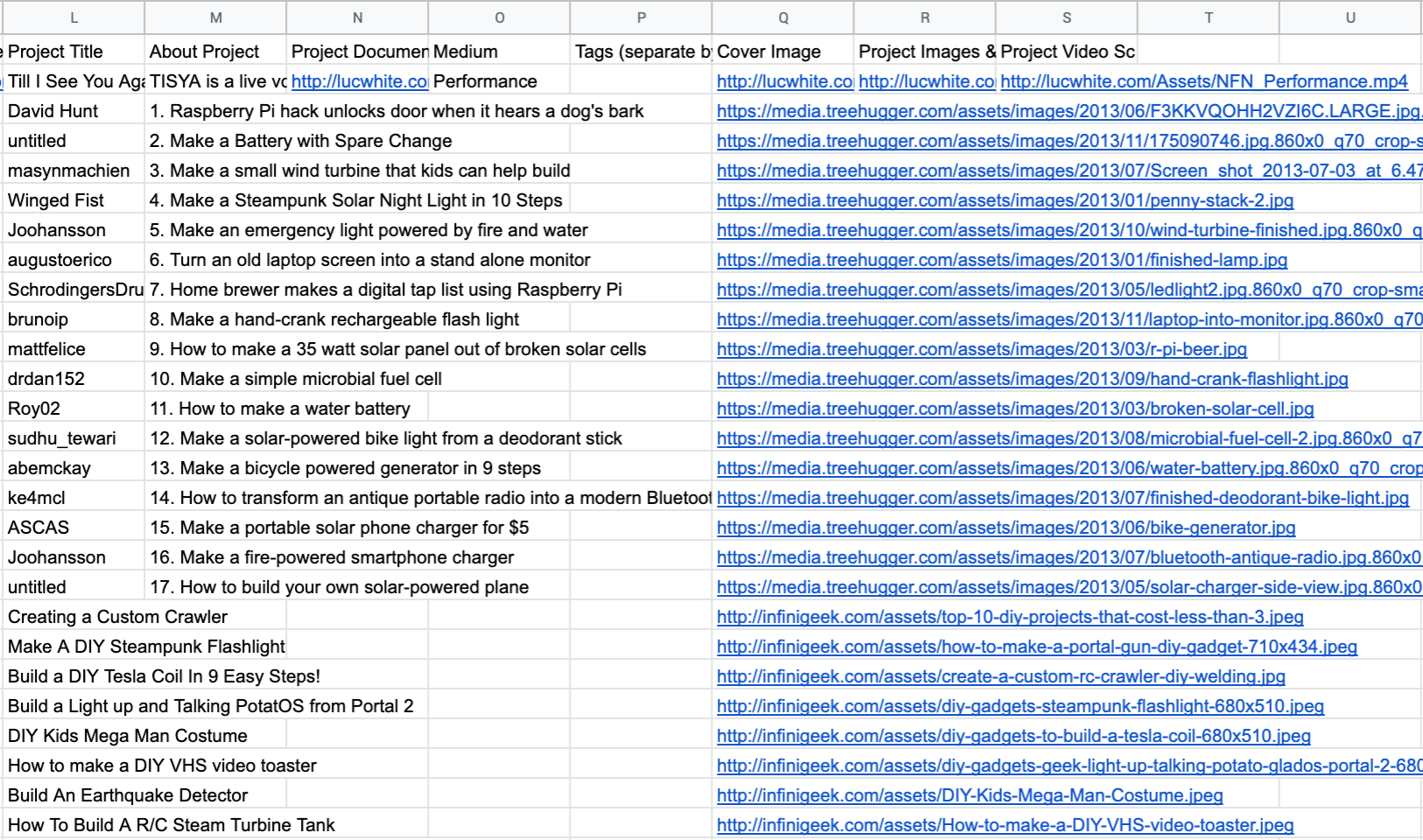
At this point I knew that having a good amount of placeholder data would help simulate how the site would look with all the student projects. At this time I was also learning web scraping in python using beautiful soup. So I decided to test using web scraped information in an excel format to populate the images and texts.
At the time I was helping one of the professors with social media for the Lion Share Fund and so I used scraped information on the Vivacious Vaquita, an endangered whale.

With the scraped and excel data confirmed and my project page starting to come along well, I decided to pivot my efforts into the front page grid layout. In addition to that I worked on getting my design to feel close to the look of the main website. I also decided to grab images from tech blogs to simulate project images that would better represent what our students would be making. I scrapped infinigeek and treehugger for some images.
At this point though I realized I couldn't web scrape to get the student projects for populating the coming site. However, all I needed was a way to get student data, aka text, images, links, videos, etc, in an excel format to auto populate.
We had already been collecting student projects using a google form, so I decided I could use that. With a month or so left, I quickly made a form and had one of the showcase members test submit into the form so I could QA test any issues that would come from this process.
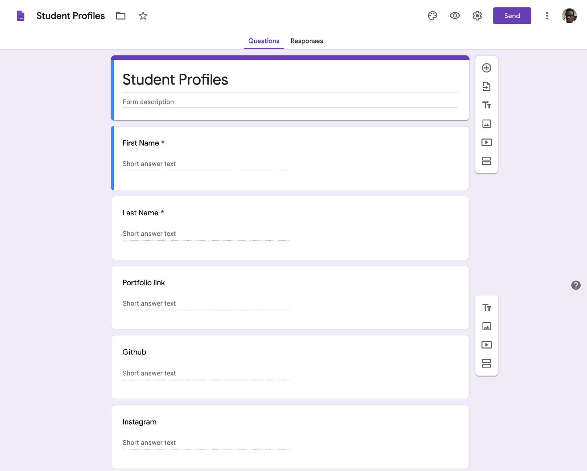
From this early testing I was able to prep the site to use excel data taken from the form. I also corrected some minor errors like handling optional fields being left completely blank, and showing a video from a link. At this point I also started making the site responsive.

With the QA done I sent out the google form to the students for their project submissions. I was adding on top of the foundational work by finalizing the design and adding little touches here and there.A week before the launch, some student projects started coming in through the google form, so I figured I would do a quick test launch. This was when my 2 biggest problems showed up.
The first one was, I had no backend to support my reactjs website and I did not know how to create a backend server. I was too low on time to learn this, test it, and make sure it would work as planned. Instead, I saw that I could generate the HTML code for each page using react. The only thing I would need to do was manually change the html file name to match the student who's project the page was referencing. While this solution was tedious, it cost less time and that's what I needed.

The other big problem involved the google form submissions. Students were submitting google drive images and videos. I had not expected this. I emailed the initial people to make their drive folders public so I could work with it. With some research and dedication I was able to find that you can embed an image from drive on to a web page if the image is public view and you convert the link into a "uc=?id". So the link goes from:
to
https://drive.google.com/uc?id=1Z-8ayUROKhh6Nu2R6obGn0xpfQYj6u0T.
This could not be done directly in drive, but an open=?id link could be generated and placed in the form. Knowing this I wrote the instructions for generating this in the google form.
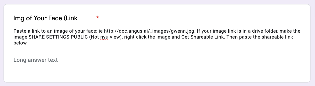
While not everyone followed the instructions, it was a helpful bandage to get some projects prepped and ready. In the end I had to do some data cleaning from the google form to make all the files appropriate for reading. This lead to some of the projects not being live on the site during launch. However, the launch itself was a success and we had 10 projects on the page at the very beginning and after the first week of launch added the rest of the projects since the design was done and all that was needed was data cleaning.


Once again, here is the final webpage.